Bootstrap Navigation Bar (PAID)
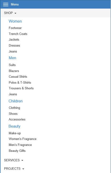
The Bootstrap Navigation Bar extension implements a multi-level, responsive navigation bar optimized for desktop computers and mobile (touch) devices. On desktop computer the menu will display a standard drop down menu and on mobile devices it will display a multi-level stacked menu with the familiar ‘hamburger’ icon. The menu is inspired by the Bootstrap navbar component.
Unlike most other drop down menus, this menu requires a click to open the sub menus instead of mouse over. This makes the menu work the same way on desktops and touch devices.
Features
• Supports Font Awesome icons
• Hamburger menu can be positioned at the left and right side of the menu
• Sub menu padding.
• Supports full width in layout grids.
• Configurable arrow offset and drop down shadow color.
• Text alignment in sub menus
• Integrates with @font-face and Google fonts functionality of WWB.

Demo
https://www.wysiwygwebbuilder.com/support/bootstrapnavigationbar.html
Download demo version (save disabled)
Bootstrap Navigation Bar Extension
https://www.wysiwygwebbuilder.com/support/bootstrapnavigationbar.html
Download demo version (save disabled)
Bootstrap Navigation Bar Extension
Buy full version via 2checkout for $4.95
https://secure.2checkout.com/order/checkout.php?PRODS=4698083
https://secure.2checkout.com/order/checkout.php?PRODS=4698083
Navigation Extensions Pack Discount
This extension is also part of the Navigation Extensions Pack - Volume 1 which includes 7 commercials menu extensions for only $19.95!
This extension is also part of the Navigation Extensions Pack - Volume 1 which includes 7 commercials menu extensions for only $19.95!