An Introduction to Cards
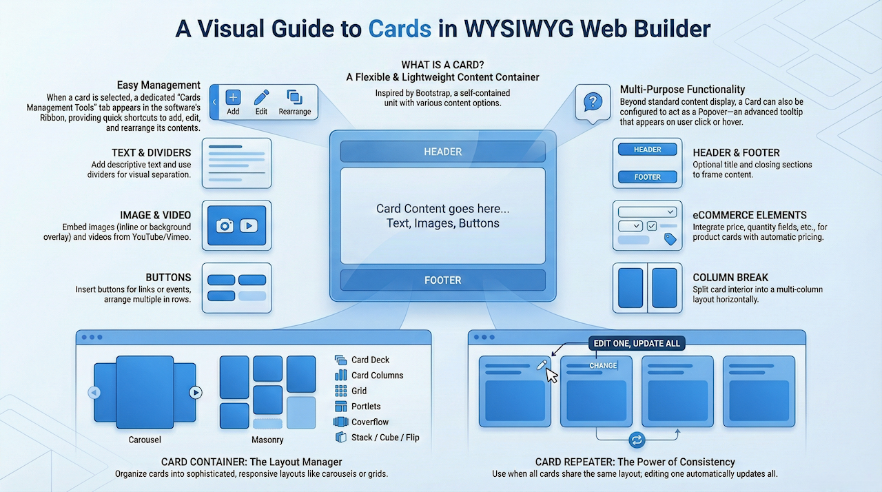
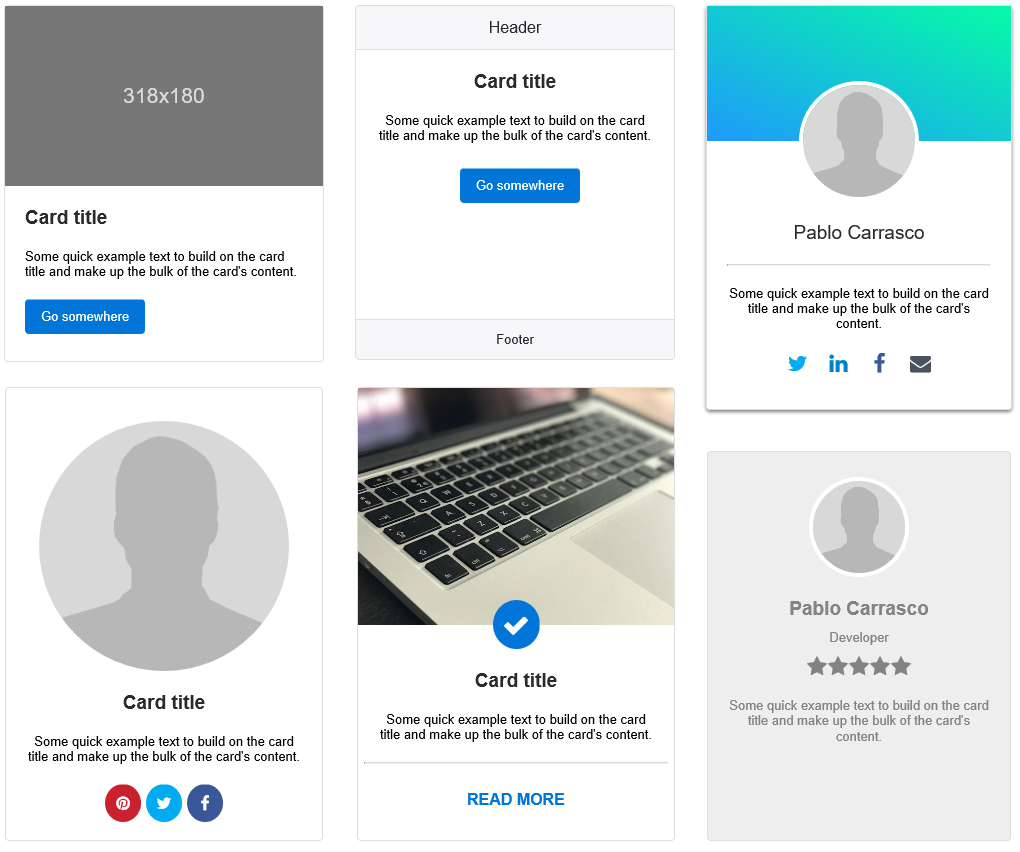


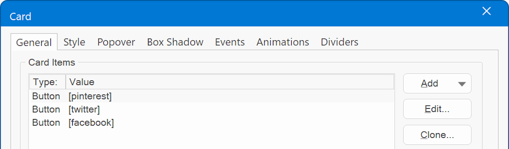
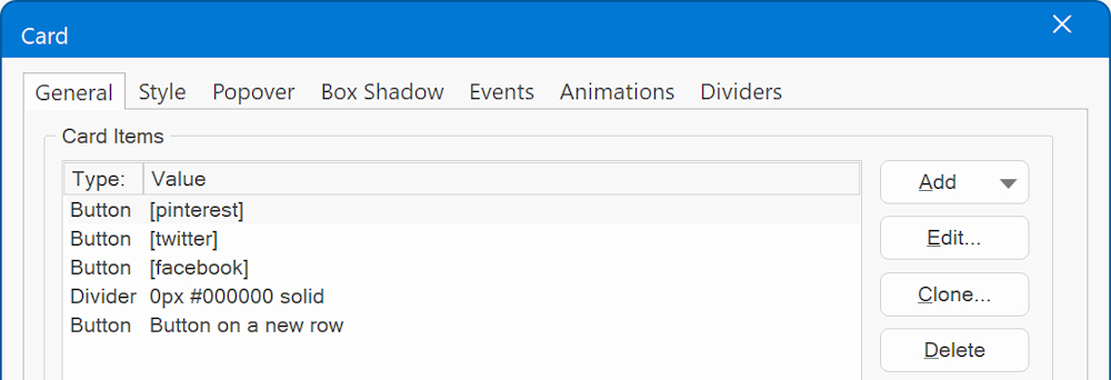
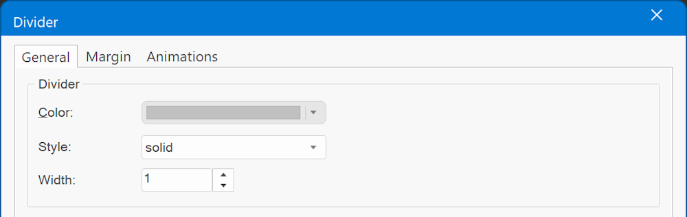
Divider
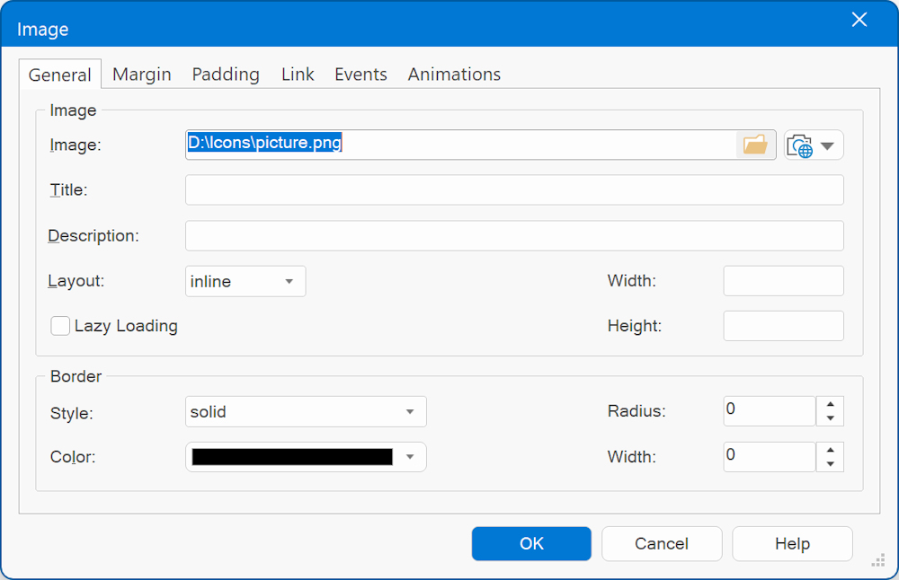
Image
Text

Other content types
https://wysiwygwebbuilder.com/ecommerce_cards.html
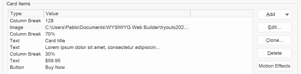
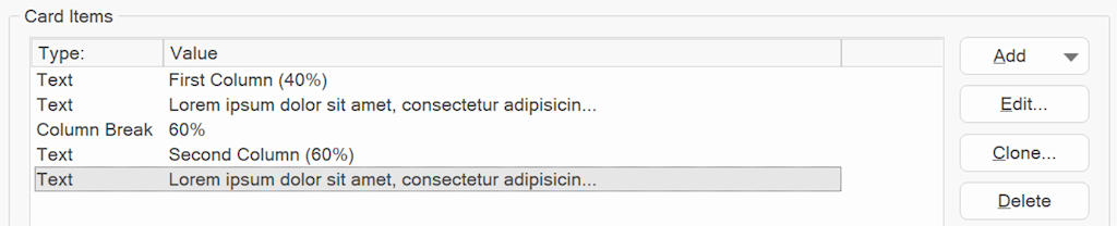
Horizontal Cards
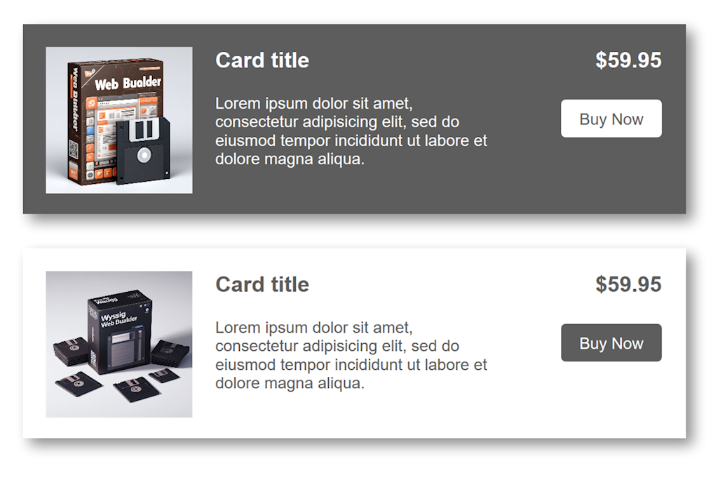
1. Define each column, with each column break marking the start of a new column. You can specify the value in either pixels or percentages
Card Decks

Popover

https://www.wysiwygwebbuilder.com/support/cards
Download the demo project:
https://www.wysiwygwebbuilder.com/support/cards/cards.zip
How to line up card items horizontally?
This can be done by placing the cards in a Card Container: (or flexbox container):
- make sure the 'Read More' button of each card is the last card item in the card.
- use a negative bottom-margin, for example -20. This causes the button to align 20 pixels from the bottom of the card.
Demo:
https://www.wysiwygwebbuilder.com/support/cardsalign.html
Card Container
A Card Container is a dedicated object to simplify laying out a series of cards. It has the following layout options:
- card deck
Automatically aligns the cards horizontally with equal width and height. Even with different content lengths!
Basically, card deck is just a simplified version of a Flex Container where the flexbox properties of the Card will be forced to
flexgrow: 1, flexshrink: 1, flexbasis: 0%
- card columns
Organize the cards into columns. Cards are ordered from top to bottom and left to right.
- carousel
Displays the cards in an animated carousel. The number of cards per slide and spacing is configurable per breakpoint. It is also possible to set how many cards will be scrolled per page. The card carousel can be controlled via events: media play, media stop, slideshow next, slideshow previous
- masonry
Cards will be dynamically rearranged based on the available space in the browser window. Masonry measures all of the items and rearranges them in the best way with what is spatially available. You can configure different column counts in breakpoints.
- grid
Easily create a grid (columns / rows) with cards.
- portlets
In portlets mode, the visitor of the website can rearrange cards via drag & drop. Also, cards can be hidden or expanded/collapsed. The state of the portlets will be saved for the next time the user visits the website.
- coverflow
Display the cards in a 3D cover flow carousel.
- stack
Display the cards stacked on top of each other.
- cube
Display the cards in a 3D cube.
- flip
One card is visible at a time. A 'flip' transition will be used to switch between cards.
Card Container Demos
https://www.wysiwygwebbuilder.com/support/wb16tryouts/masonry-demo.html
https://www.wysiwygwebbuilder.com/support/wb17tryouts/wb17_portlets.html
https://www.wysiwygwebbuilder.com/support/wb18tryouts/wb18_cardcontainer.html
https://www.wysiwygwebbuilder.com/support/wb16tryouts/wb16_rolloverlayer_cards.html
Card Repeater
A Card Repeater operates similarly to a Card Container, with a key distinction: all cards within it share the same layout and style. This means that any modification made to one card will automatically propagate to all other cards within the same container.
For instance, if you add a button to one card, it will simultaneously appear in all the other cards. Removing an item will have the same effect, as it will be removed from every card within the repeater. Similarly, adjustments to the style attributes, such as font size, background color, or borders, will be uniformly applied to all cards.
Furthermore, duplicating a selected card is a breeze – simply click the clone button to create an identical copy.
Please note that due to the uniformity in layout and structure, you cannot drag and drop a card into a Card Repeater if it possesses a different configuration. The Card Repeater excels in maintaining consistency across its cards, ensuring a harmonious and synchronized design.
