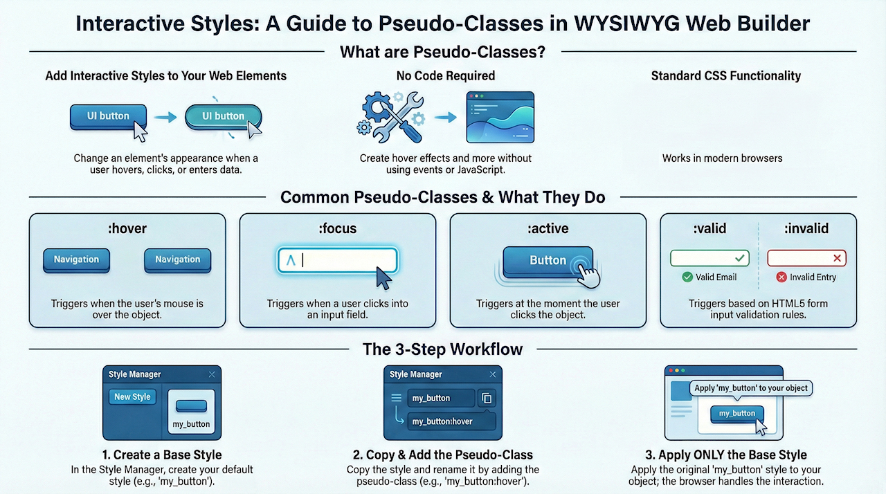
Do more with styles: Pseudo classes (interactive styles).
As you may already know, styles can be useful to quickly apply the same style to multiple objects. You can create/edit styles in the Style Manager. For more information see also this related tutorial: Using the Style Manager.
However you can also use styles for interaction! For instance you can create hover effects without events or javascript by defining styles with pseudo-classes.
Pseudo-classes allow you to style elements as the user interacts with them providing visible feedback:
:hover
changes the appearance of the object when the mouse is hovering over it.
:focus
will be applied to the the object when it receives the focus.
:active
sets the style of the object when it is clicked or selected.
:invalid
Sets the style if the input is invalid (HTML5 validation).
:valid
Sets the style uif the input is valid (HTML5 validation).
:required
Sets the style if the input is required (HTML5 validation).
We will demonstrate the usage of pseudo classes with the form elements button and editbox. Requires WYSIWYG Web Builder 8.5.2 or newer!
Using :hover pseudo class
Step 1
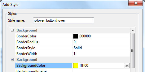
Open the Style Manager and add a new style. Name it 'rollover_button'. Specify the following values:
- border color: #000000
- border style: Solid
- border width: 1
- background color: #dcdcdc
You can change any of the other styles if you wish...
Click OK to save the style.
Open the Style Manager and add a new style. Name it 'rollover_button'. Specify the following values:
- border color: #000000
- border style: Solid
- border width: 1
- background color: #dcdcdc
You can change any of the other styles if you wish...
Click OK to save the style.

Step 2
Select the new style in the Style Manager and click 'Copy'.
Change the name to: rollover_button:hover
Set the background color to #ffff00
Click OK to save the style.
Now you have 2 new styles in the Style Manager:
rollover_button
rollover_button:hover
Select the new style in the Style Manager and click 'Copy'.
Change the name to: rollover_button:hover
Set the background color to #ffff00
Click OK to save the style.
Now you have 2 new styles in the Style Manager:
rollover_button
rollover_button:hover
Step 3
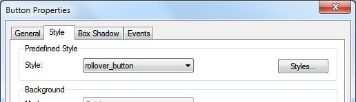
Insert a (push) button, open properties and click the Style tab.
Now select 'rollover_button' (not 'rollover_button:hover'!!!) in Predefined Style.
Click OK to save the changes.
Insert a (push) button, open properties and click the Style tab.
Now select 'rollover_button' (not 'rollover_button:hover'!!!) in Predefined Style.
Click OK to save the changes.
Step 4
Preview the page and hover your mouyse over the button.
You will notice that static button is now interactive!
Preview the page and hover your mouyse over the button.
You will notice that static button is now interactive!
Using the :focus pseudo class
Now let's use the :focus pseudo class for an input field.
Step 1
Open the Style Manager and add a new style. Name it 'form_field'.
Specify the following values:
- border color: #000000
- border style: Solid
- border width: 1
- background color: #FFFFFF
Click OK to save the style.
Step 2
Select the new style in the Style Manager and click 'Copy'.
Change the name to: form_field:focus
Set the background color to #ffff00
Click OK to save the style.
Now you have 2 new styles in the Style Manager:
form_field
form_field:focus
Step 3
Insert an editbox, open properties and click the Style tab.
Now select 'form_field' (not 'form_field:focus'!!!) in Predefined Style.
Click OK to save the changes.
Step 4
Preview the page and click inside the editbox.
You will notice that background color changes. If you set the focus to another element on the page then the background color will return to its original value.
Using the :valid and :invalid pseudo classes
For the last example we are going to change the appereance of an input field based on the user input in combination with HTML5 form validation.
Step 1
Open the Style Manager and add a new style. Name it 'validation'.
Specify the following values:
- border color: #000000
- border style: Solid
- border width: 1
- background color: #FFFFFF
Click OK to save the style.
Step 2
Select the new style in the Style Manager and click 'Copy'.
Change the name to: validation:invalid
Set the background color to #ff0000
Click OK to save the style.
Step 3
Select the new style in the Style Manager and click 'Copy'.
Change the name to: validation:valid
Set the background color to #00ff00
Click OK to save the style.
Now you have 3 new styles in the Style Manager:
validation
validation:invalid
validation:valid
Step 4
Insert an edit box, open properties and click the Style tab.
Now select 'validation' in Predefined Style.
Step 5
Click the 'Validation' tab of the editbox.
Set mode to HTML5.
Set data type to Email address.
Step 6
Preview the page and enter an invalid email address. You will notice that background turns red.
Next enter a valid email address. The background should become green.
Of course you can define your own styles and use other properties for the different input states, like shadow or different border colors.
And because this is all standard CSS functionality you can use any pseudo clas that is supported by CSS.
Related FAQ article:
How to insert an image inside text by using styles?