How to create Responsive Text?
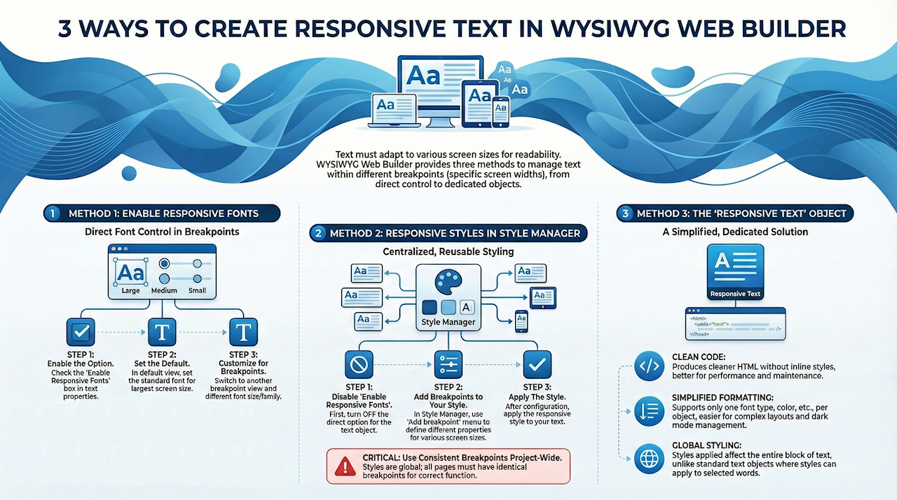
In WYSIWYG Web Builder, there are 3 ways to make the text object responsive:
• Enable Responsive Fonts in the Text object
• Use responsive styles in the Style Manager
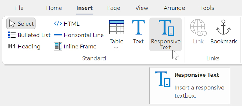
• Use the dedicated 'Responsive Text' object
If you are not familiar with breakpoints then please read these tutorials first:
Introduction to Responsive Web Design - The Basics
Responsive Web Design in WYSIWYG Web Builder
• Enable Responsive Fonts in the Text object
• Use responsive styles in the Style Manager
• Use the dedicated 'Responsive Text' object
If you are not familiar with breakpoints then please read these tutorials first:
Introduction to Responsive Web Design - The Basics
Responsive Web Design in WYSIWYG Web Builder
Enable Responsive Fonts
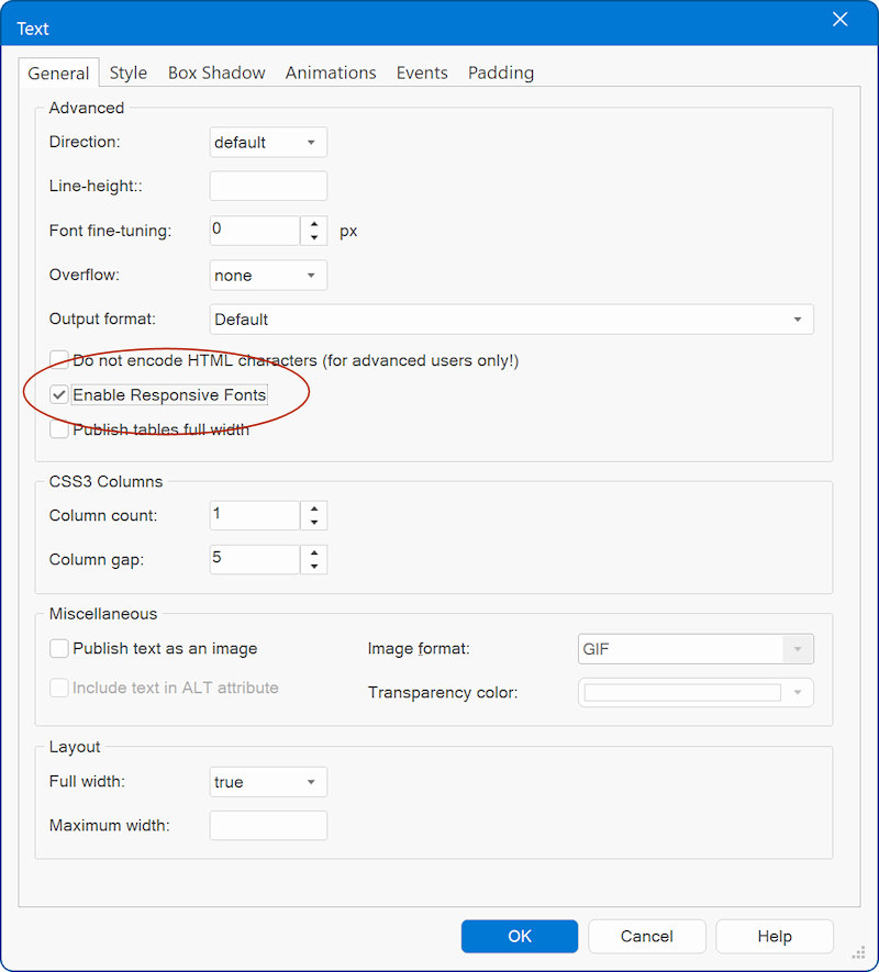
The option 'Enable Responsive Fonts' can be found in the properties of the text object. When this option is enabled, then the text object can have different font sizes in breakpoints. This can be useful if you need a larger font for smaller screens. Each breakpoint can have a different text size or even a completely different font!
Step 1
Enable Responsive Fonts in the text properties
Step 2
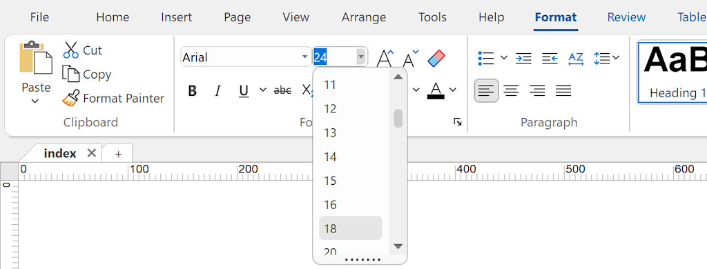
Switch to the default view and set the default font.
Step 3
Switch to another breakpoint and select a different fonts size.
Enable Responsive Fonts in the text properties
Step 2
Switch to the default view and set the default font.
Step 3
Switch to another breakpoint and select a different fonts size.
Notes:
- When this option is enabled, you can only use one font-family and font-size for the entire text object!
- The use of styles in combination with this option is not supported because the responsive fonts will be applied to the text directly and that will overwrite the style. However the Style Manager also supports breakpoints, so if you wish to use styles then do not enable responsive fonts, but use responsive styles instead.
- Make sure the 'Output Format' is either set to 'Default' mode or 'Include line-height in text styles' otherwise the text will not float.
Responsive Styles in the Style Manager
Another way to to use a different font, text size or color in breakpoints in by using styles. Using this method makes it possible to have different fonts in the same text object and make the text responsive at the same time.
Step 1
First make sure 'Enable Responsive Fonts' is OFF, otherwise you cannot use styles on text.
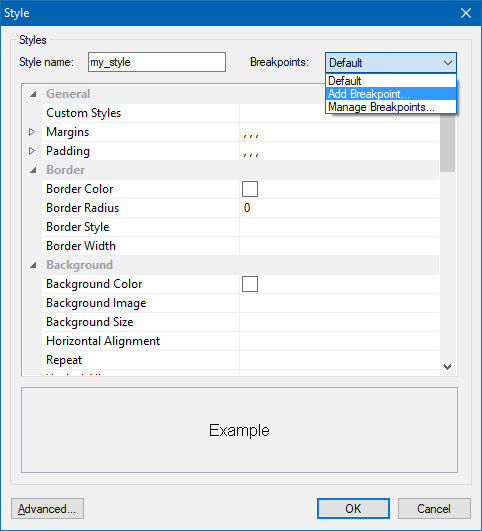
Step 2
To add a breakpoint to Styles, select 'Add breakpoint' in the Breakpoints drop down menu. You can use 'Manage Breakpoints' to add, edit or remove breakpoints. To switch to another breakpoint to edit the properties, select the value in the drop down menu or select 'Default' to go to the default properties.
Step 1
First make sure 'Enable Responsive Fonts' is OFF, otherwise you cannot use styles on text.
Step 2
To add a breakpoint to Styles, select 'Add breakpoint' in the Breakpoints drop down menu. You can use 'Manage Breakpoints' to add, edit or remove breakpoints. To switch to another breakpoint to edit the properties, select the value in the drop down menu or select 'Default' to go to the default properties.
Step 3
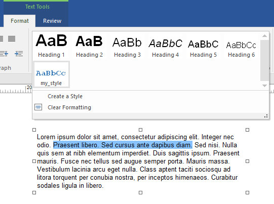
After you have added the breakpoints to the style, you can apply it to the text.
After you have added the breakpoints to the style, you can apply it to the text.
Important Note:
Styles are global (they apply to the entire project, instead of just one page) they have their own breakpoints.
This means that all your pages have to be set up with the same breakpoints to make responsive styles for fonts work.
Styles are global (they apply to the entire project, instead of just one page) they have their own breakpoints.
This means that all your pages have to be set up with the same breakpoints to make responsive styles for fonts work.
Responsive Text Object
WYSIWYG Web Builder also has a dedicated "Responsive Text" object. This is a simplified text object. It only supports one type of font, color etc. per object. This makes the object easier manageable in complex layout (for example when using style or dark mode). Unlike the standard text object, styles/classes apply to the entire object, not just the selected text. Also, the object produces cleaner HTML output, because it does not use any inline styles.