An introduction to CSS animations
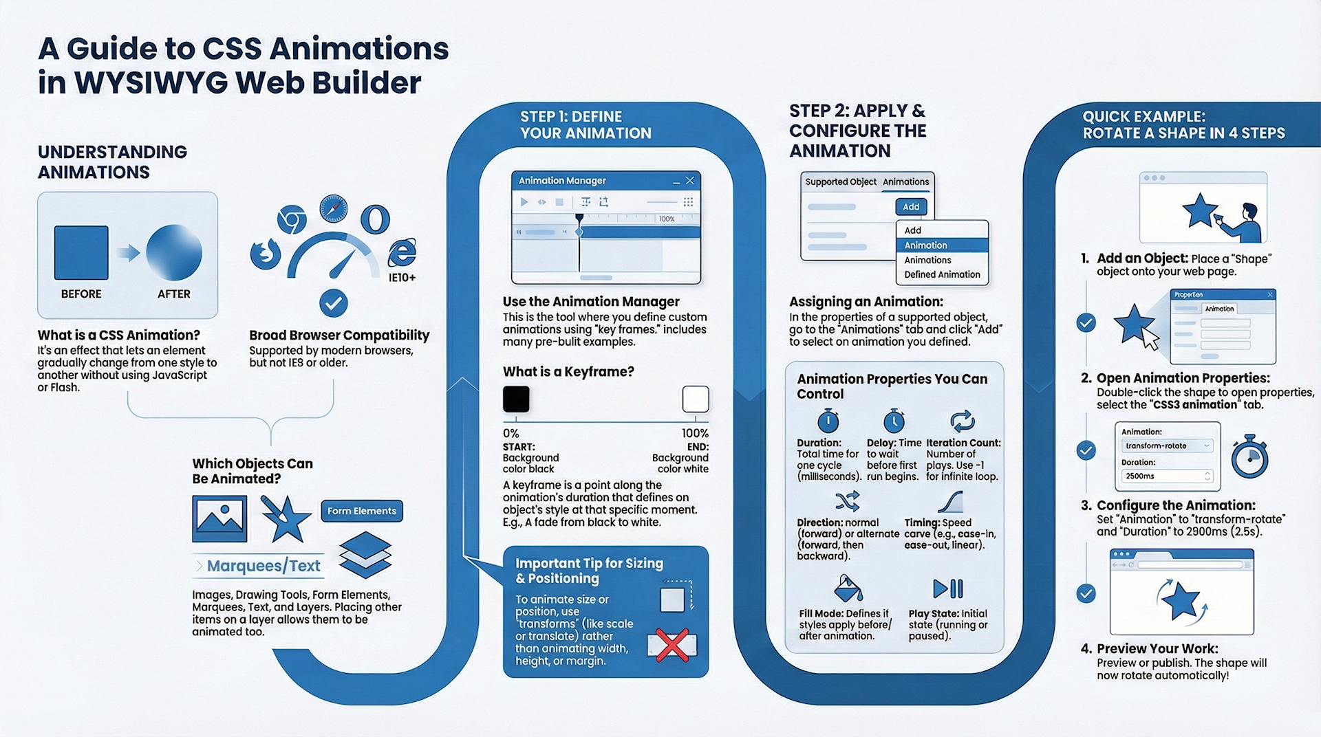
WYSIWYG Web Builder has built-in support for CSS3 animations. Animations are supported by all modern browsers It will work in FireFox/Safari/Opera/Chrome/IE10 but not by Internet Explorer 9 or older!
An animation is an effect that lets an element gradually change from one style to another without using JavaScript or Flash. Animation
effects can be applied to a wide variety of CSS properties, including background-color, width, height, opacity, transforms (rotate, skew, scale, translate) and many more. The Animation Manager can be used to define animations. These animations can be assigned to an object in the CSS3 Animation section of the object's properties.
It's also possible to associate an animation to a style (in the Style Manager). This makes it possible to dynamically assign an animation to an object (through events -> set style).
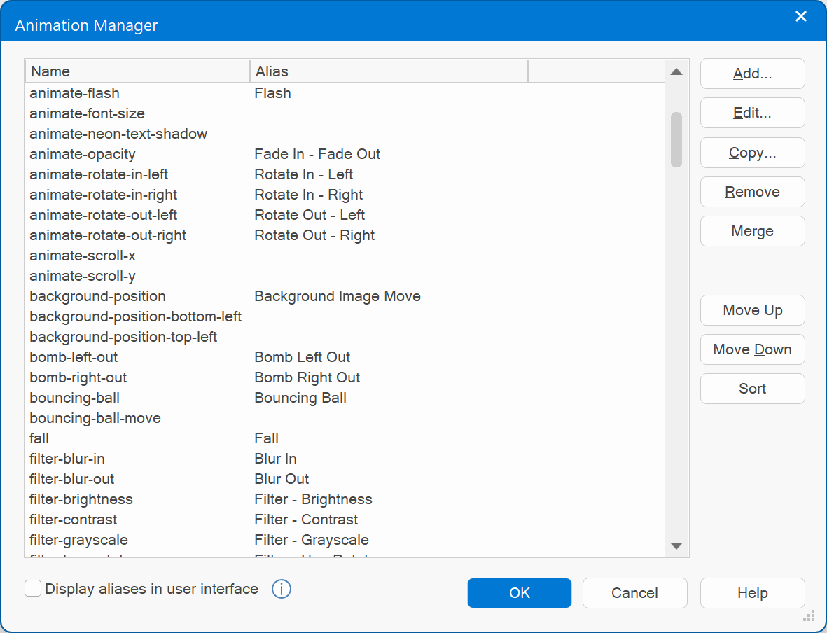
Animation Manager
The Animation Manager can be used to define animations (with key frames).
We have included a large collections of example animations to help you get started.
We have included a large collections of example animations to help you get started.
Important:
Not all animations are useful for all objects. For instance animating the background color of an image or shape will not do anything because there is no background in that case. Also animating left/top/width/height/margin/etc will not work for most objects because these values are usually fixed. If you want to animate the size or position of an object it's better to use transforms. See the examples for more details.
Not all animations are useful for all objects. For instance animating the background color of an image or shape will not do anything because there is no background in that case. Also animating left/top/width/height/margin/etc will not work for most objects because these values are usually fixed. If you want to animate the size or position of an object it's better to use transforms. See the examples for more details.
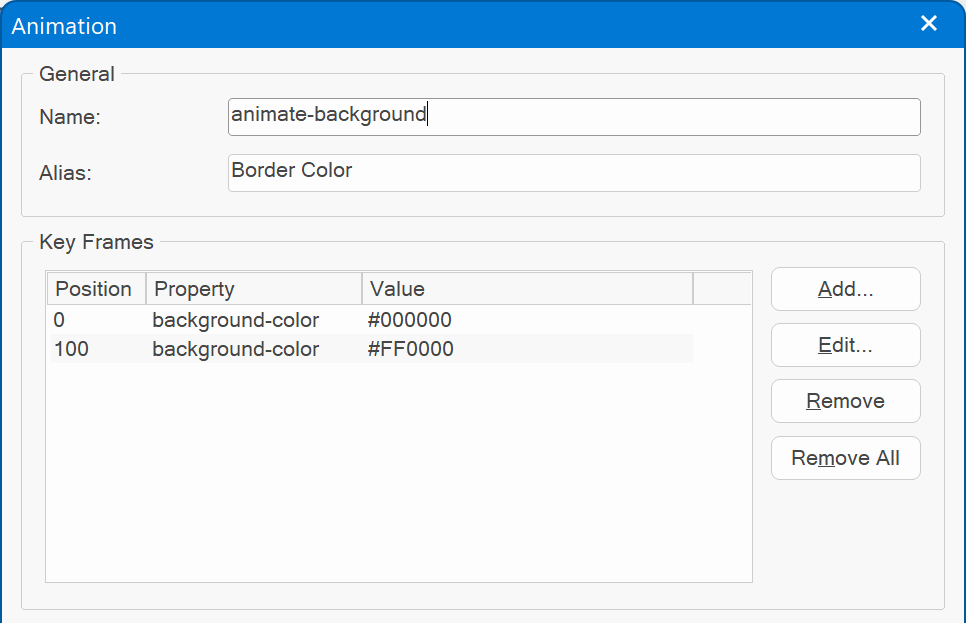
The first step in creating animations is to define 'key frames'. A key frame is a point that defines the start and end of a transition. The most simple animation will have two key frames - one at the start (0%) and one at the end (100%) - whereas more complex animations will have more key frames in between.
In the key frame you set the position (in percentages) along the duration of the animation. You must specify at least two key frames (0% and 100%), but you can have many as you like. Each key frame defines a property (and value) that is applied to the element at the specified stage of the animation.
In the key frame you set the position (in percentages) along the duration of the animation. You must specify at least two key frames (0% and 100%), but you can have many as you like. Each key frame defines a property (and value) that is applied to the element at the specified stage of the animation.
Example:
First key frame: 0% -> background color #000000
Last key frame: 100% -> background color #FFFFFF
This will smoothly animate the background color of an object from black to white.
Note that the timing is defined in the animation properties of the object, not in the animation itself.
This way you can reuse an animation in different objects with different timing settings.
Assign an animation to an object
Objects that do support animations have an Animations tab in their properties. Here you can add, edit or remove animations.
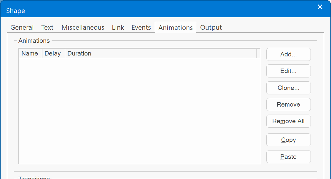
You can assign multiple animations to an object. Click 'Add' to add a predefined animation to the object.
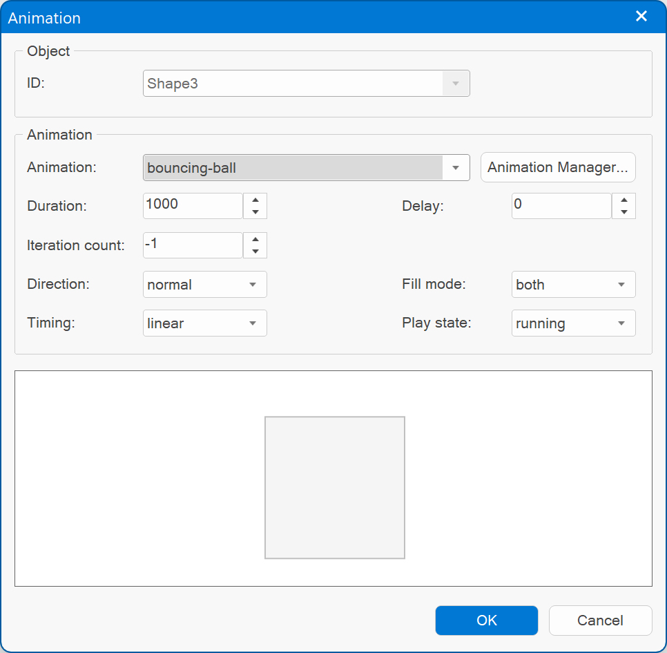
Animation
Specifies the animation (as created in the Animation Manager) to use for the object. The animation will start automatically on page load.
Duration
Specifies the duration of the animation in milliseconds.
Delay
Delay causes the very first run of the animation to wait for the specified amount of time (in milliseconds) before beginning to execute.
Note that the delay will not occur during animation repeats. It will only be used for the first iteration of the animation.
Iteration count
You can configure how many times you would like the animation to play, or you can even make it repeat infinitely by using -1.
Direction
Set this to normal to play the animation from start to finish. Or use alternate to play it forward and then backwards.
Timing
The animation-timing-function specifies the speed curve of the animation.
The speed curve defines the time an animation uses to change from one set of CSS styles to another. The speed curve is used to make the changes smoothly. The animation-timing-function uses a mathematical function, called the Cubic Bèzier curve, to make the speed curve.
Fill Mode
Defines how styles are applied to the target of your CSS animations outside of the animation itself.
By default your CSS animations won’t affect the object's properties you’re animating until the first keyframe is played, then stops affecting it once the last keyframe has completed.
In some cases you may want the properties to be affected before the animations starts or after it has finished. For example if the animation starts hidden or with a different opacity. Then you can select 'Forwards', 'Backwards' or 'Both'.
Play State
This option determines whether an animation's initial state is running or paused.
Example: Add rotate animation to a shape
Step 1
Add a shape to the page.
Step 2
Double click the shape to open its properties and select the CSS3 animation tab.
Step 3
Set the Animation to 'transform-rotate' and the duration to 2500 (2.5 seconds).
Step 4
Preview or publish the page. The shape will now be animated!
Add a shape to the page.
Step 2
Double click the shape to open its properties and select the CSS3 animation tab.
Step 3
Set the Animation to 'transform-rotate' and the duration to 2500 (2.5 seconds).
Step 4
Preview or publish the page. The shape will now be animated!