Photo Gallery
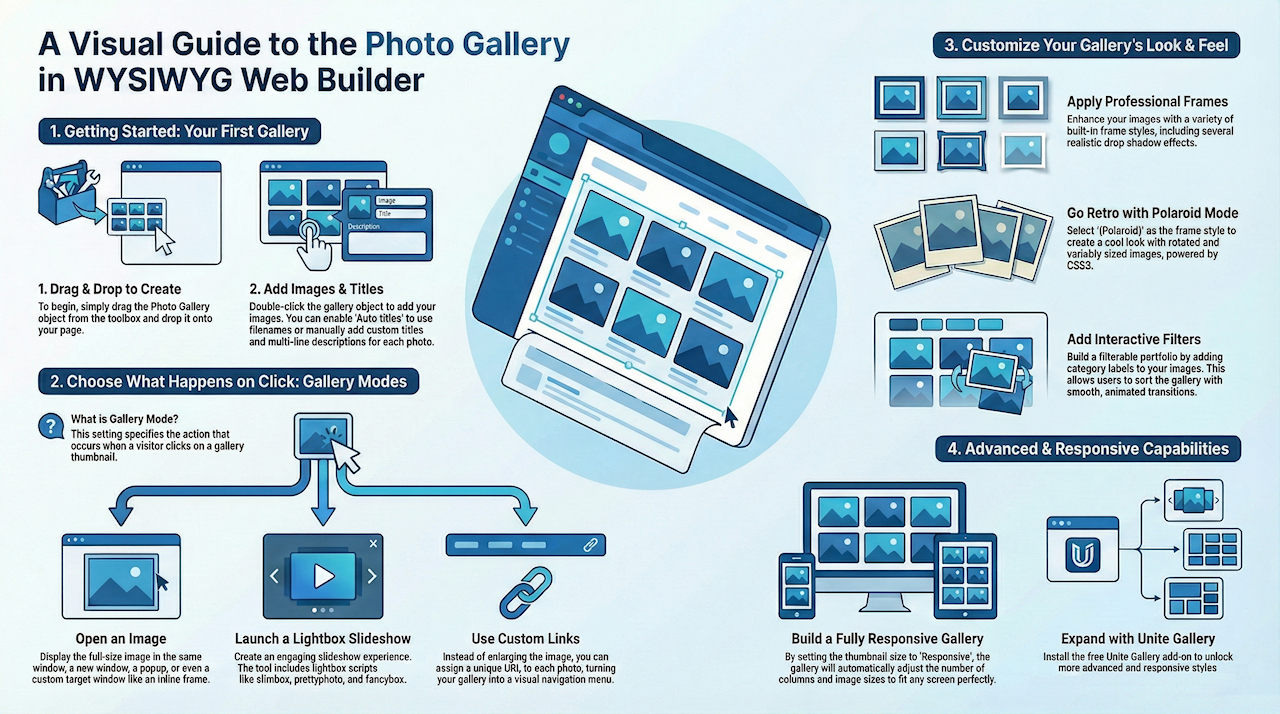
WYSIWYG Web Builder's Photo Gallery is a powerful tool to create amazing galleries. The gallery support titles, descriptions, frames, lightboxes, polaroid mode and much more! This tutorial gives an overview of some of the great features of the Photo Gallery with live examples.
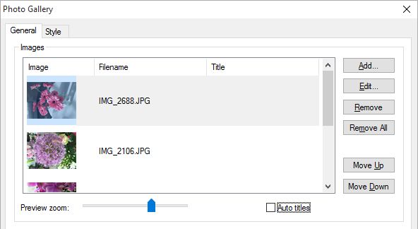
Adding a gallery is very easy: just drag & drop the Photo Gallery object to the page, then double click it to add images.
Adding a gallery is very easy: just drag & drop the Photo Gallery object to the page, then double click it to add images.
Adding Titles
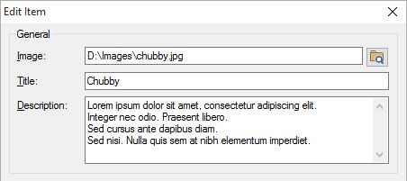
Each photo can have a title and description. You can enable 'Auto titles' to automatically assign titles to the images based on the filename or set the title manually: select the photo in the list and click 'Edit'. The description can have mulitple lines.
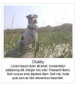
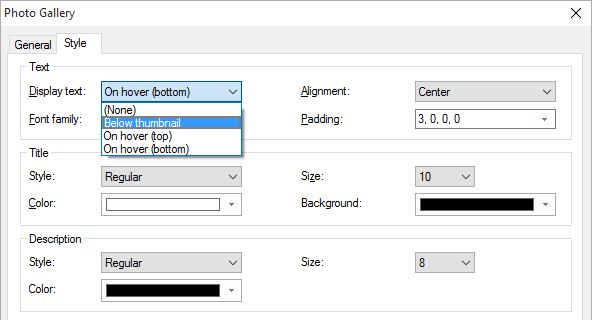
The Photo Gallery has different title modes and the font and colors can be customized.
Gallery Mode
The gallery mode specifies what happens when the user clicks on an image.
• Open in the same browser window
The larger version of the image will be displayed in the same browser window.
Click here for a demo.
• Open in a new browser window
The larger version of the image will be displayed in a new browser window.
Click here for a demo
• Open in a popup window
The larger version of the image will be displayed in a popup browser window. The popup window will have the size of the full image.
Click here for a demo
• Open in another window
The larger version of the image will be displayed in another window. For example in an inline frame. You can specify the name of the target window in the Name field.
Click here for a demo
• Open in a jQuery Dialog
The image will be displayed in a jQuery Dialog. Use the Settings button to modify the appearance of the dialog.
Click here for a demo
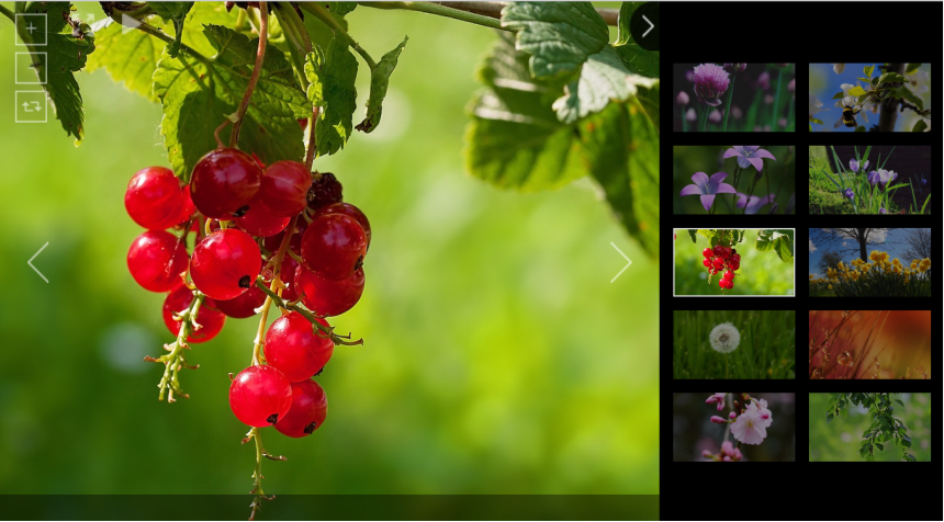
• Light Box Gallery
If you select this option then clicking on one of the images will start a lightbox slideshow.
Click here for a demo
WYSIWYG Web Builder has several built-in lightbox scripts like slimbox, prettyphoto and fancybox. And you can download additional galleries/lightbox add-ons from the website:
https://www.wysiwygwebbuilder.com/free_extras.html
• Use Links
This option allows you to assign links to images, instead of opening the image.
Click here for a demo
• Open in the same browser window
The larger version of the image will be displayed in the same browser window.
Click here for a demo.
• Open in a new browser window
The larger version of the image will be displayed in a new browser window.
Click here for a demo
• Open in a popup window
The larger version of the image will be displayed in a popup browser window. The popup window will have the size of the full image.
Click here for a demo
• Open in another window
The larger version of the image will be displayed in another window. For example in an inline frame. You can specify the name of the target window in the Name field.
Click here for a demo
• Open in a jQuery Dialog
The image will be displayed in a jQuery Dialog. Use the Settings button to modify the appearance of the dialog.
Click here for a demo
• Light Box Gallery
If you select this option then clicking on one of the images will start a lightbox slideshow.
Click here for a demo
WYSIWYG Web Builder has several built-in lightbox scripts like slimbox, prettyphoto and fancybox. And you can download additional galleries/lightbox add-ons from the website:
https://www.wysiwygwebbuilder.com/free_extras.html
• Use Links
This option allows you to assign links to images, instead of opening the image.
Click here for a demo
Frames
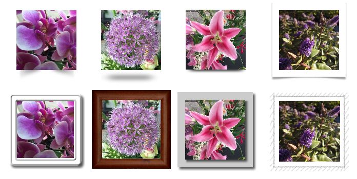
One of the great features of the Photo Gallery is the support for image frames, this includes several drop shadow effects.
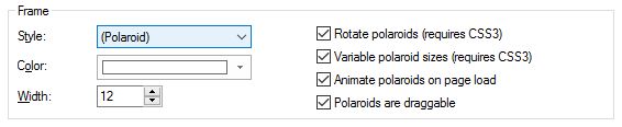
Polaroid Mode
The Photo Gallery also has Polaroid mode' which uses CSS3 and has a few cool effects like rotated or variable sized polaroids.
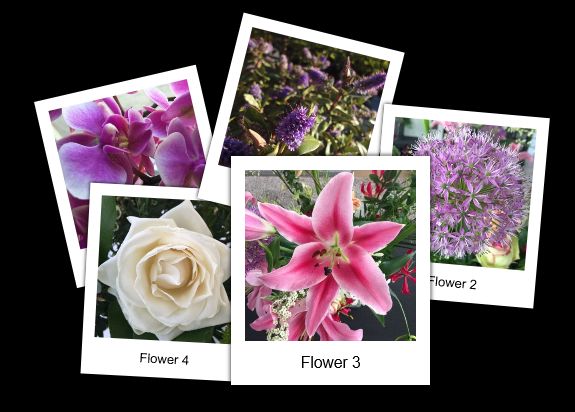
To enable Polaroid mode select (Polaroid) as the frame style. For the best effect set the frame width to 20 or more and use 'white' as the frame color. Also adding a little shadow will give it a more realistic effect. For more details about the available options please see the help.
Responsive Gallery
The Photo Gallery can be used in responsive layouts. When the thumbnail size is set to 'Responsive' the gallery can have a different number of columns in breakpoints! The images in the gallery will be responsively resized based on the gallery size. This means for example that when the gallery is inside a Layout Grid that it can be full width or use a percentage of the screen size width.
Click here for a demo
Download project file
Click here for a demo
Download project file
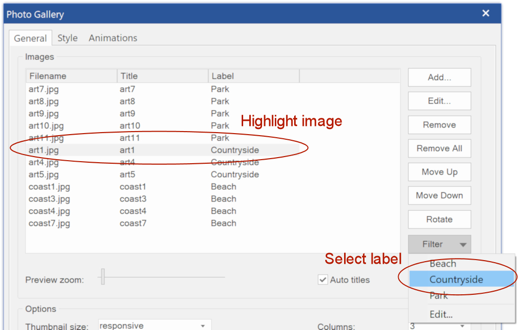
Adding Filters
The 'Filter' option enables a filterable portfolio-style gallery of images.
Demo: https://www.wysiwygwebbuilder.com/support/wb16tryouts/wb16_photogallery_filter.html
Demo: https://www.wysiwygwebbuilder.com/support/wb16tryouts/wb16_photogallery_filter.html
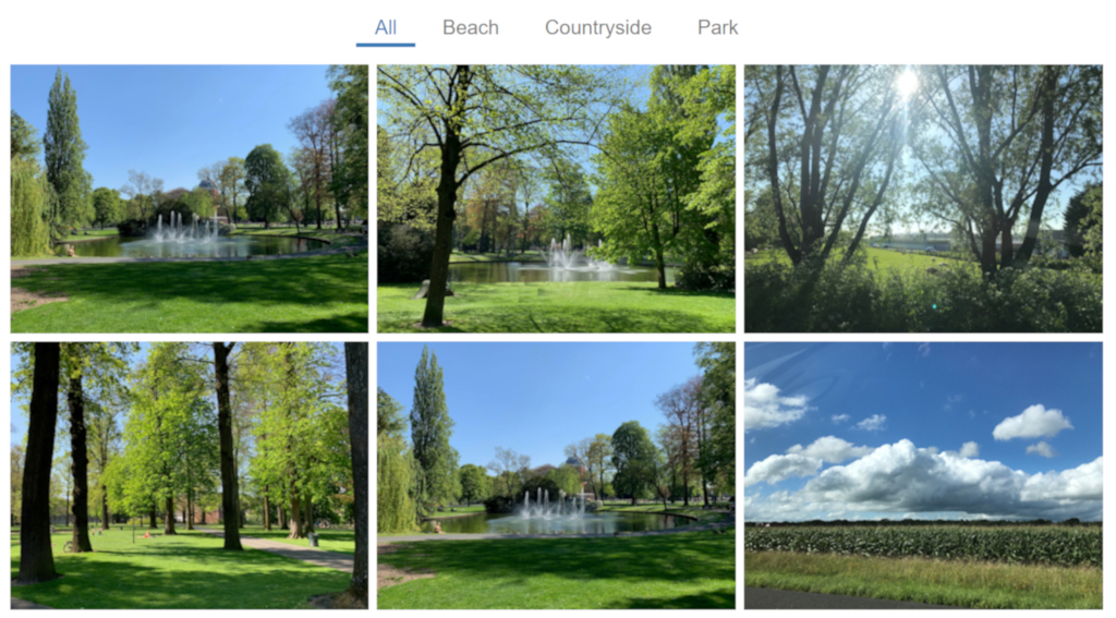
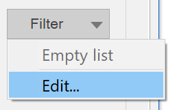
To enable filters, you will first have to add labels via Filter -> Edit.
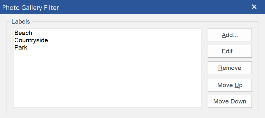
After adding labels, select and highlight the image above, click the ‘filter’ button and then choose the label for it.
The filter bar has many styling options and the transition between categories can be animated.
The filter bar has many styling options and the transition between categories can be animated.
The photo gallery has lots of other cool features. Check out the help for more details.
Unite Gallery
The photo gallery also has support for “Unite Gallery”. This is responsive gallery with many different styles, like carousel, grid, nested tiles and justified tiles.
Unite Gallery is available as a free lightbox add-on.
https://www.wysiwygwebbuilder.com/free_extras.html
Demo:
https://www.wysiwygwebbuilder.com/support/wb16tryouts/wb16_unitegallery.html
Unite Gallery is available as a free lightbox add-on.
https://www.wysiwygwebbuilder.com/free_extras.html
Demo:
https://www.wysiwygwebbuilder.com/support/wb16tryouts/wb16_unitegallery.html