Picture
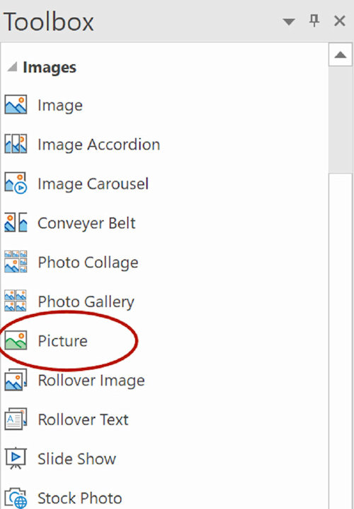
The Picture object can be used to add responsive images to web pages.
A different image can be specified for each breakpoint and/or screen resolution.
A different image can be specified for each breakpoint and/or screen resolution.

Picture Properties
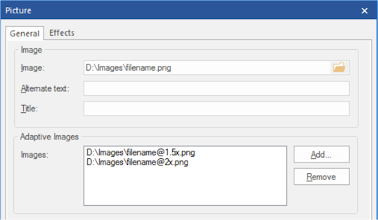
Image
This property specifies the default image. For each breakpoint you can configure a different image.
Alternate text
This text, usually a short description, appears in place of the object in browser when images are unsupported or have been disabled. The is also use by search engines, so it's important to use a meaningful description.
Title
In modern browsers this title appears as a ToolTip when you move the mouse over the image.
Adaptive Images
The Picture object also supports high resolution displays by using pixel density descriptors such as 1x, 1.5x, 2x, and 3x.
You can include different versions of the image by using names like: filename@1.5x.png, filename@2x.png
For example, if the display is set to 150% then the browser will use the filename@1.5x.png image.
Filters/Effects
Pictures also have experimental support for CSS3 filters (blur, contrast, brightness, hue, saturation, negative, sepia, grayscale).
These filters are available via the content menu (right click) or the Ribbon/main menu.

How is the Picture object different than the standard Image object?
A standard Image only supports 1 image which is the same in all breakpoints and for all resolutions. With the picture object you can specify a different image for each breakpoint and for different resolutions.
If you apply a filter to a standard image then a modified version of that image will be published, the image will be processed by the application. If you apply a filter to a Picture then the effect will be processed by the browser. The original image(s) will be published.
The Image object supports many different filters unique to WYSIWYG Web Builder, the Picture only support standard CSS filters.